Code
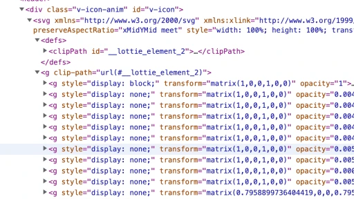
When you open a website for the first time the animated logo catches your eye right away. In html file it is located under div class called v-icon-anim inside of which we can find svg xmlns element with defs element that stores parts of graphical object. All the animated parts of the logo are under g elements that use transform=matrix function that transforms and styles elements in a two-dimensional space.

UI
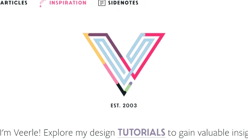
The nice animated logo in the middle of the front page is the first thing you notice while visiting the site. It starts as a few colored dots that gather altogether and turn into a giant styled V letter. I assume this logo in a shape of V letter repeats the first letter of the website's name.

UX
The colored animated logo catches your eye right away and there is a surprise element as you don't see lots of animated logos on other websites and it is always makes you want to visit the website again and again.

Summary
In overall, Veerle is a creative website journal using different colors and unusual font size no wonder as the website is used for inspiration. I like it when developers use different font size and make it work on all the devices. Also I like colorful websites but I understand not every website can be colored.